The dashboard
The dashboard is where the triangle comes together on one screen — Revenue, Cash, and Costs side by side, so you can see where the business stands without opening four tabs. It’s the first thing you land on, and every number on it follows the space you’re in.
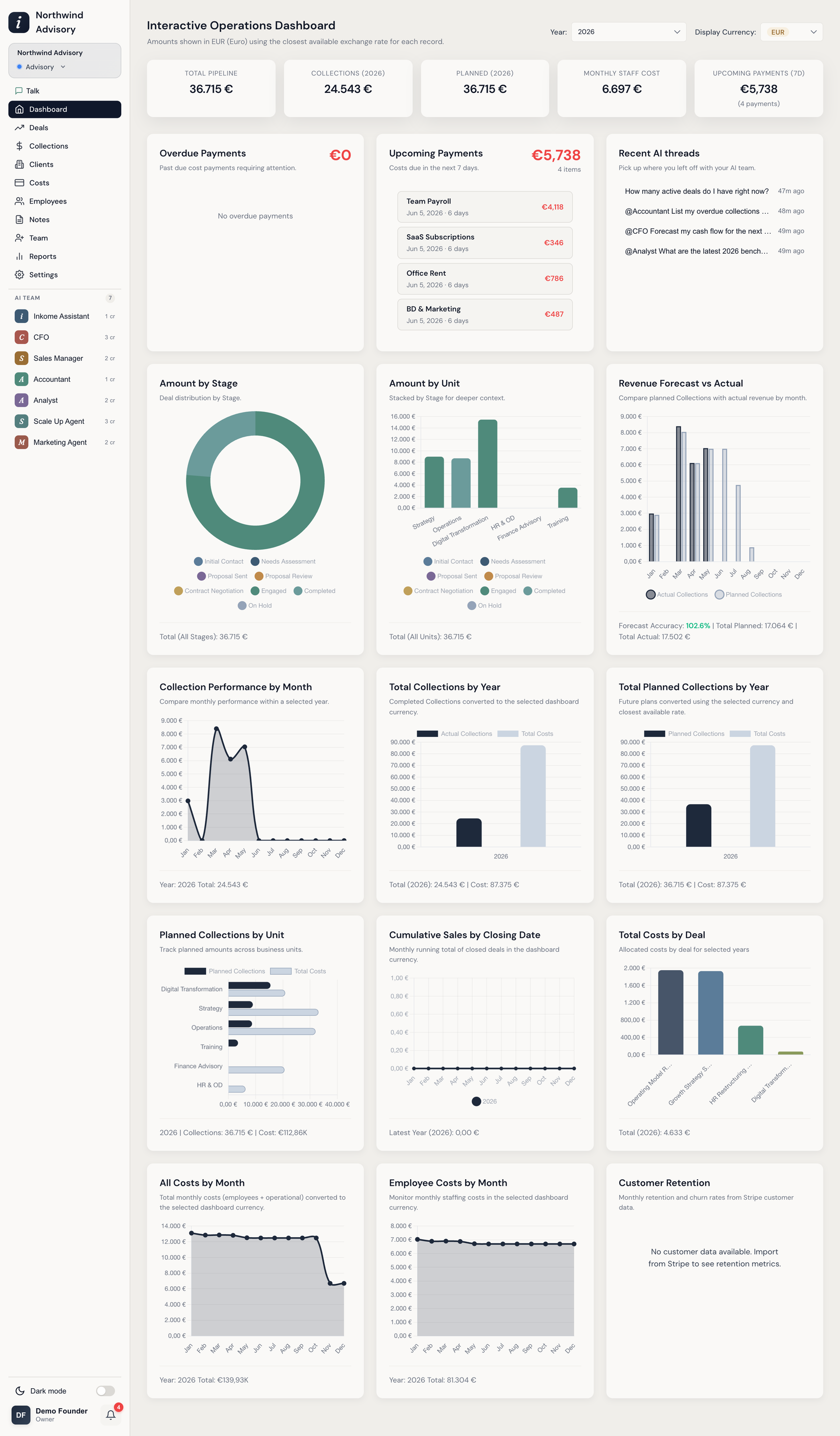
How the dashboard reads your data
A short bar at the top of the dashboard reminds you that amounts are shown in the selected currency using the closest available exchange rate for each record. You control three things from the dashboard controls:
| Control | What it does |
|---|---|
| Currency | Converts every figure to one currency (TRY, USD, or EUR) so mixed-currency data compares cleanly. Your choice is remembered. |
| Stage | Narrows the pipeline widgets to a single stage, or ALL. |
| Unit | Narrows to a single unit, or ALL. |
Several widgets also have their own year selector so you can step back through history.
The summary cards
The row of cards at the top is the quick pulse of the business:
- Total Pipeline — the value of open deals.
- Collections (This Year) — what’s actually come in, in the selected currency.
- Planned (This Year) — what your collection plans said you’d bring in.
- Monthly Staff Cost — recurring staffing cost per month.
- Upcoming Payments (7d) — cost payments due in the next seven days.
The widgets
Below the cards, the dashboard is a grid of chart widgets. The full set includes:
| Widget | What it shows |
|---|---|
| Overdue Payments | Past-due cost payments needing attention. |
| Upcoming Payments | Costs due in the next 7 days. |
| Amount by Stage | Deal value distributed across pipeline stages. |
| Amount by Unit | Value per unit, stacked by stage for deeper context. |
| Revenue Forecast vs Actual | Planned collections against actual revenue, by month, with a forecast-accuracy figure. |
| Collection Performance by Month | Monthly collection performance within a selected year. |
| Total Collections by Year | Completed collections per year, converted to the selected currency. |
| Total Planned Collections by Year | Future planned amounts per year. |
| Planned Collections by Unit | Planned amounts across business units. |
| Cumulative Sales by Closing Date | A running monthly total of closed deals. |
| Total Costs by Deal | Allocated costs per deal across the selected years. |
| All Costs by Month | Total monthly costs (staff plus operational). |
| Employee Costs by Month | Monthly staffing costs. |
| Customer Retention | Monthly retention and churn rates. |
Widgets adapt to your business type
The dashboard isn’t fixed — it surfaces what matters for the kind of stream you’re running. The labels shift with your business type (a card reading Collections in a services space reads differently in a product space, via dynamic terminology), and some widgets only appear where they make sense — for example, the Customer Retention widget is built around recurring-revenue data. So two spaces of different types won’t show an identical dashboard.
Want the data, not the chart?
Every chart is a starting point. To pull the underlying records into a spreadsheet, use export. For an AI-written narrative built on top of these numbers — with insights and commentary — see Reports.
Prev: Payment history & bulk payments Next: Reports Up: User guide index